Cate Platform Redesign
Using UX to make the platform intuitive and accessible to all.
- Client
- São Paulo City Hall
- Partners
- Communitas & Vanzolini
- Role
- UI/UX Designer
- Timeline
- 1 month
- Category
- UI/UX Design · Platform redesign
Explore the interactive prototype
Before diving into the process, you can browse the final result. The high-fidelity Figma prototype lets you explore the platform's complete flow.
About the project
Cate is a platform from São Paulo City Hall aimed at people entering the city's job market. It brings together a job board, preparatory courses, entrepreneurship resources, and job fairs in partnership with Contrata SP — connecting companies and candidates and helping publicize openings and projects.
My role
UI/UX Designer, responsible for creating the site's entire interface and experience, working together with the Communitas team and building on benchmarking provided by Vanzolini. The project was validated and approved by Communitas and Vanzolini.
Tools
- Figma — screen design and prototyping
- Monday — deadline and delivery management
- Google Meet — meetings
- Freepik — image creation
Rich content that wasn't being used
The platform's previous design wasn't intuitive, especially for an audience with little familiarity with technology. As a result, many users struggled to apply for jobs or access courses — leading to frustration and recurring complaints.
The main problem wasn't the content, which was rich and relevant, but the user experience: the platform couldn't deliver that value in an accessible way to the people who needed it most.
The problem
Confusing navigation and long flows made it hard to apply for jobs and access courses.
The impact
Frustration and recurring complaints from the audience that needed the platform the most.
From benchmarking to wireframes
The benchmarking stage was led by the Vanzolini team, aiming to identify how platforms with similar features behaved — their strengths and weaknesses, and above all how they handled users with little familiarity with technology.
Based on those insights, I developed flowcharts and wireframes focused on simplifying the platform's navigation and communication as much as possible, prioritizing speed and ease of use.
Due to the tight deadline, the user testing stage was replaced by a feature validation with the Communitas and Vanzolini teams, allowing us to move confidently into the high-fidelity prototype.
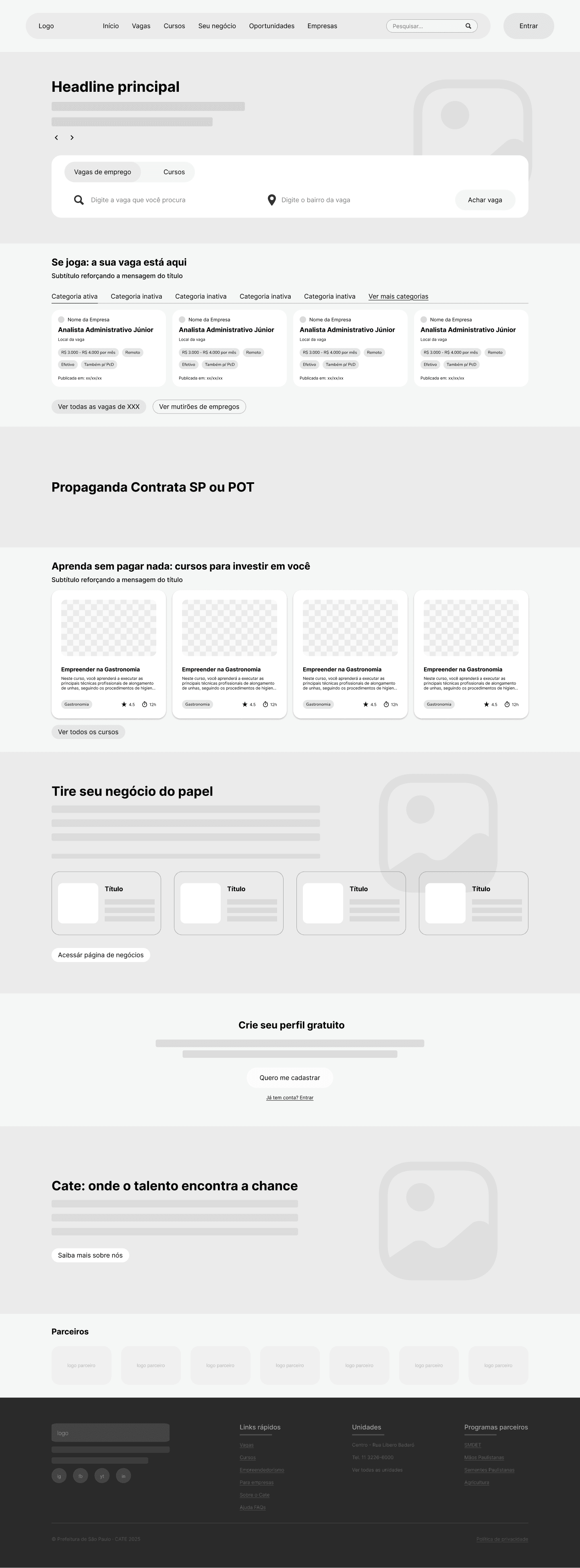
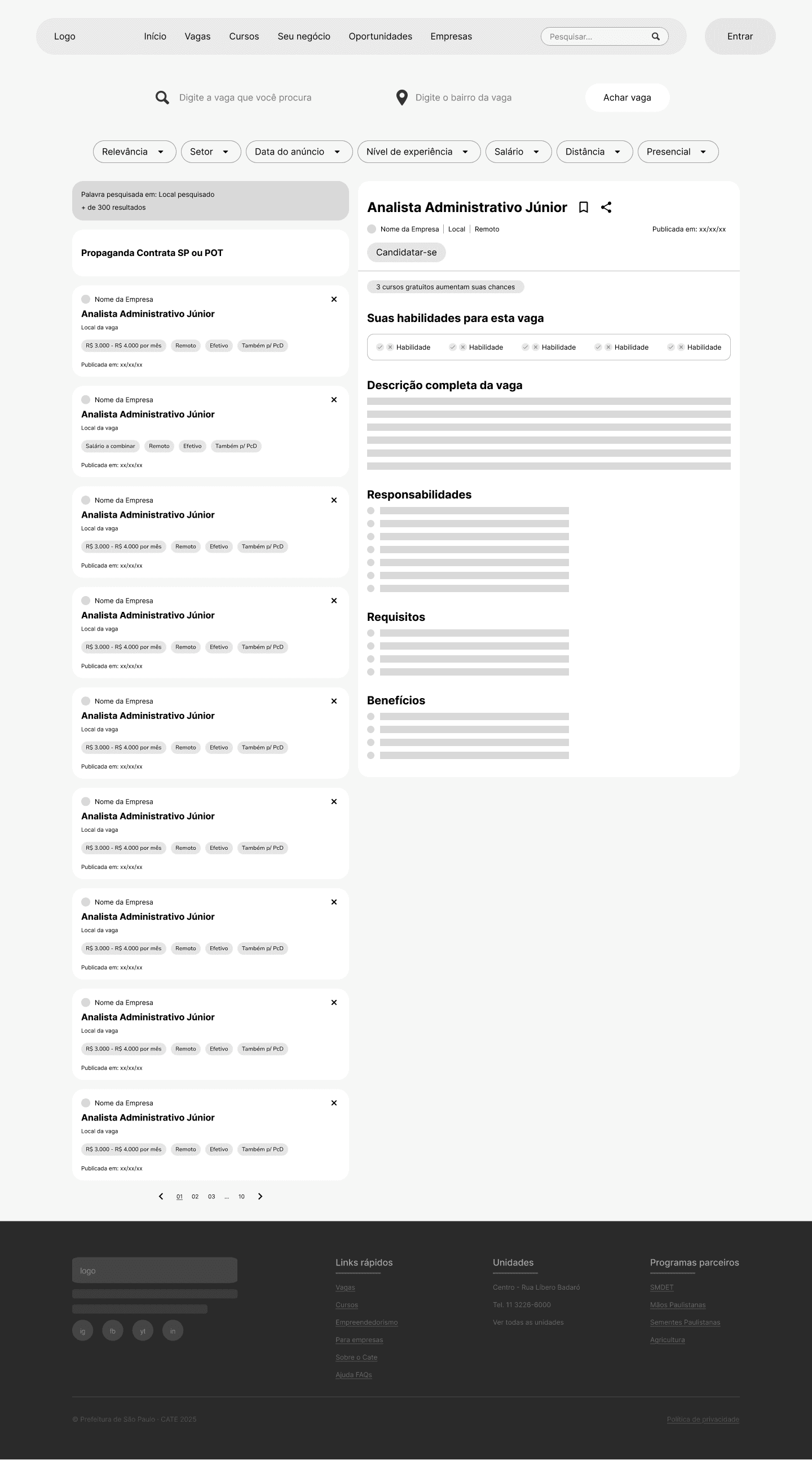
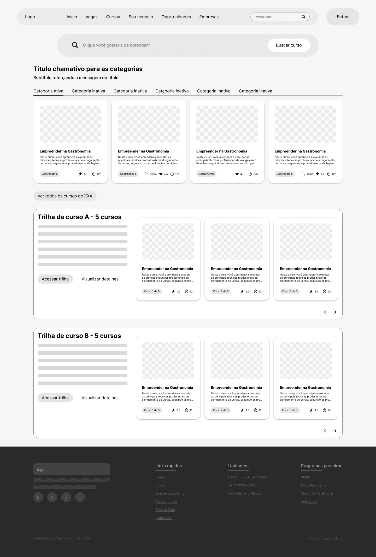
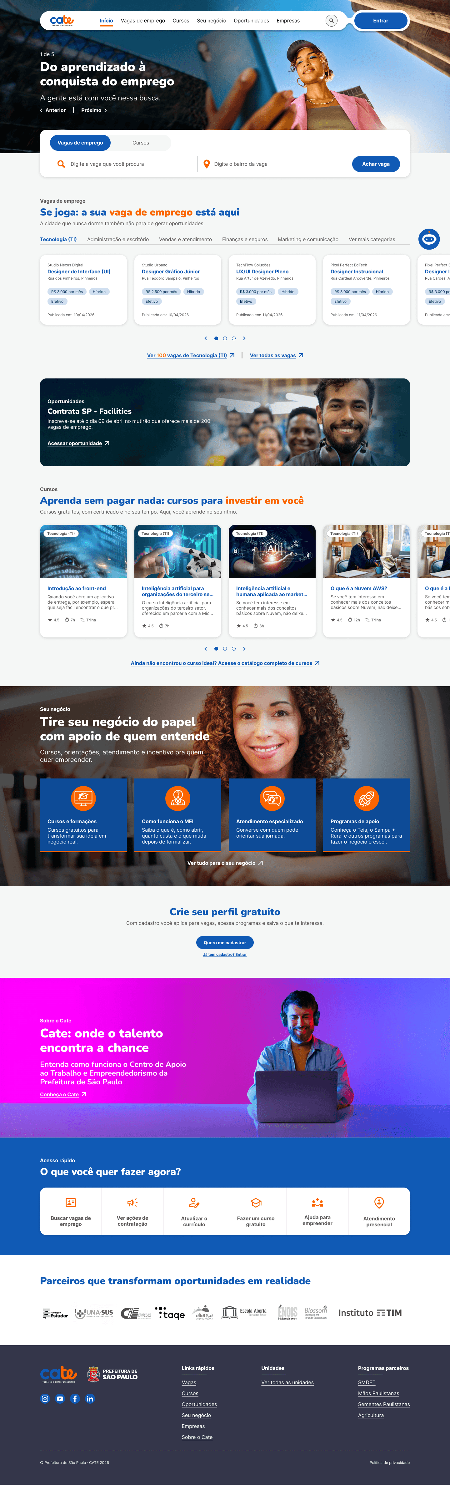
The end result was a simple, direct design. The homepage works as a hub, showing all of the platform's features at a glance. The main sections — jobs and courses — were completely restructured to make the application process simple and straightforward, limiting user error. On top of that, the content of the remaining pages was refined, and a space was added for companies to learn about Cate's benefits and how to get in touch.
Home: the platform as a HUB
A simple, direct design. The new home works as a hub, summarizing all of the platform's features so users can browse with ease.
- Central hub — every feature summarized in a single starting point.
- Search up front — a job and course search field right at the top of the page.
- Simplified navigation — fewer clicks to reach the information users look for most.

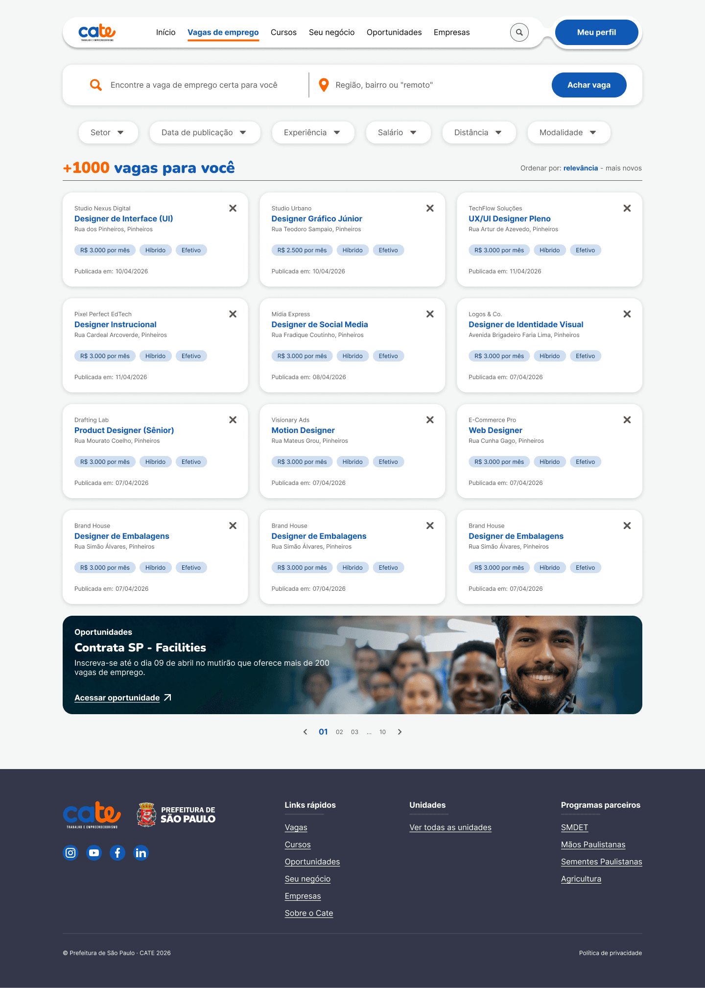
Jobs: simple, direct applications
The jobs section was completely restructured to make the application process simple and straightforward, limiting user error.
- Direct filters — industry, salary, distance, and work model one click away.
- Simple application — a shortened application flow to reduce user error.
- Full details — requirements, responsibilities, and benefits always visible.

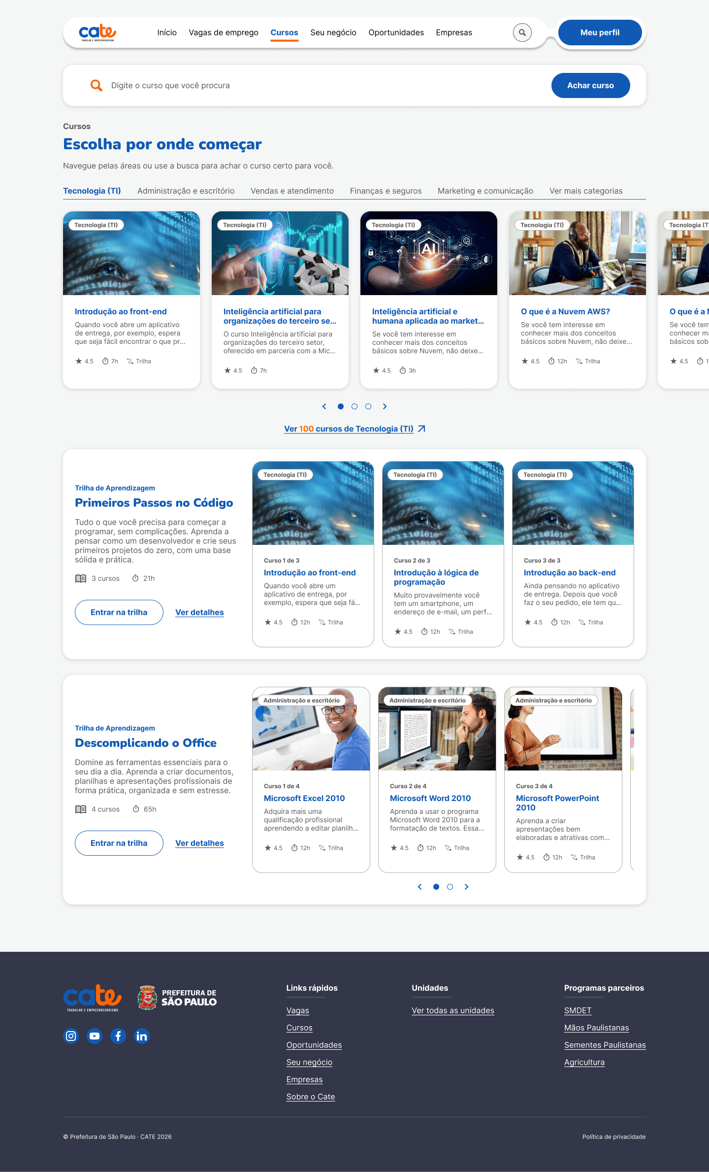
Courses: learning guided by tracks
Just like jobs, the courses section was restructured to simplify access to content, organizing it into categories and learning tracks.
- Clear categories — technology, administration, sales, and other areas clearly signposted.
- Learning tracks — courses grouped in a logical sequence, from beginner to advanced.
- Free access — certificates and self-paced learning at no cost to the user.

A tool for those just getting started
It was a great experience working side by side with the Communitas and Vanzolini teams, and a big challenge to create a platform meant to help the capital of the state of São Paulo. Despite the short timeframe for this redesign, we managed to transform the old platform into a powerful tool for people entering the job market.